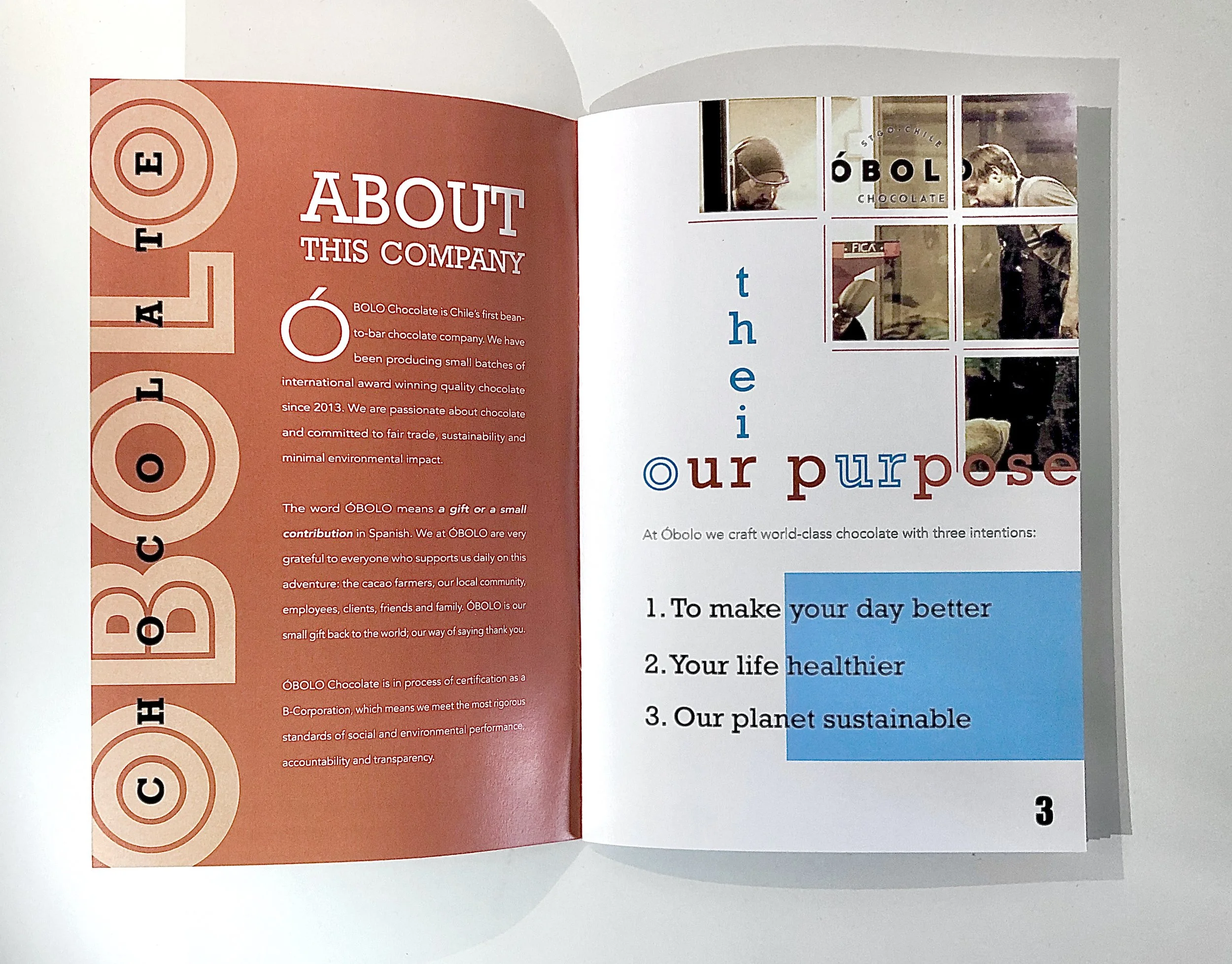
SUSTAINABILITY REPORT
When figuring out which company to pick for designing a Sustainaibility report, I wanted to choose a topic that was familiar to both me and my project’s audience; I decided to find a company that would be based around candy or sweets, and then I found Óbolo.
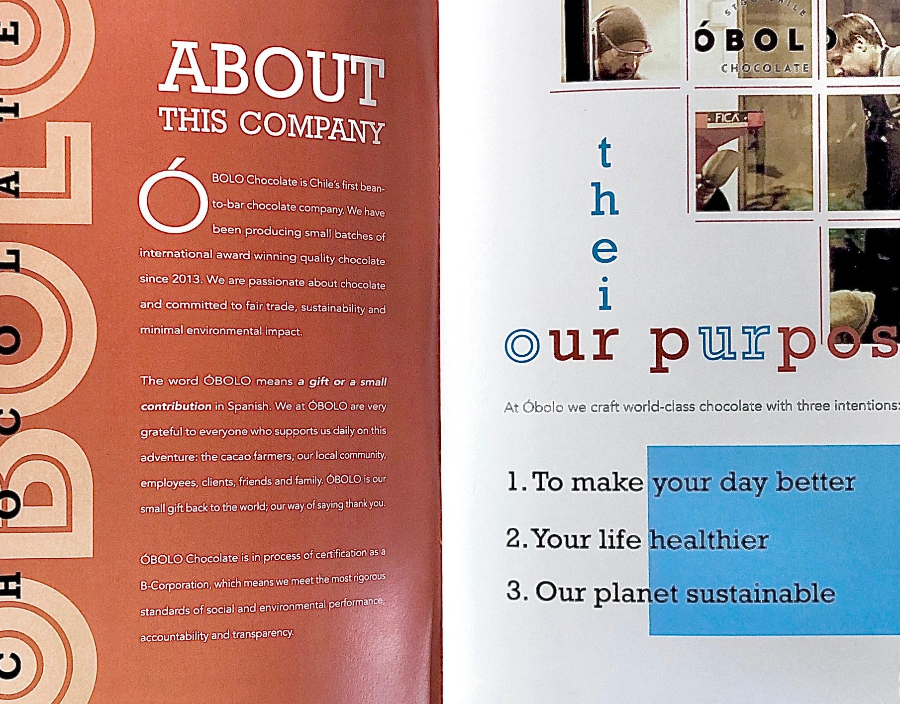
My ideas for the report were to branch out of my usual minimalist aesthetic, and to heavily play with type, and linear and organic shapes. I also wanted to stick to natural colors with a singular color pop, that color ultimately being electric blue. The blue came from one of the company’s packaging color schematics; the other choice of pop would have been red or purple.